How to Avoid the 7 Most Common Website Pitfalls
I Reviewed 60+ Websites on Twitter, Here's The 7 Most Common Issues
Welcome to the new subscribers who have joined us since the last post. Today this email is going out to 544 amazing people!
If you’re new here, please subscribe and get insights about product, design, and startups delivered to your inbox every week.
Welcome to the 38th edition of The Discourse. As part of my no-code fellowship ODNC1, I launched a repository of resources for anyone applying to the YC program. If you or someone you know is applying, please share this link.
Ok let's get into it:
Last week, I decided to ask people on Twitter to send their websites and I would give them feedback. I got flooded with over 77 inquiries! And I managed to review 60 websites.
Here are the seven most common issues I observed:
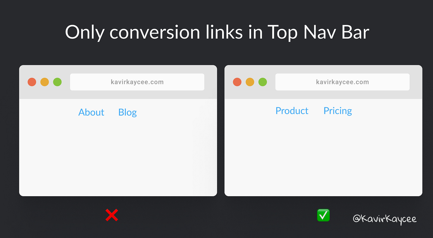
1. Non-conversion links at the top
When you're designing your website, first identify your conversion goal. This could be getting leads, sign ups, subscribers, or payments.
Once you’ve identified this goal, only retain links that drive this goal, like product and pricing. Move non-conversion links like About and Blog to the footer.
Note: These links are still available to those who want to search it out. But it’s not distracting the visitor from converting.
2. Lack of social proof
People trust a company or product when other customers recommend it. 88% of consumers trust user reviews as much as personal recommendations.
Social proof can include testimonials, case studies, or anything similar.
3. Unclear language
Don’t try to impress customers by using complex language. Use simpler words that speak to the customer.
The best way to find this out is to ask your customer to explain your service to you and then rewrite your landing page in those words.
4. Too many colors
Too many colors distract from the main message of the landing page. Keep the website simple with one primary accent color - black for text. Don’t use more than three colors. Gradients are excluded.
I wrote about colors in detail here.
5. No proof of concept
In addition to text, make use of screenshots and videos to explain the product to the customer.
6. Low quality images
Use high quality images that are either vector images (SVG) or new web formats (like JPEG200 and WebP). These image formats have higher quality and are lighter than JPEG and PNG versions of the same image.
7. Long forms
This is similar to the first point on conversion. Use forms with fewer fields initially to capture the customer’s information. You can always redirect them to a Typeform to capture more information.
Further Reading:
📘 Read of the week: Power to the person (26 min) - Packy M
That's it for today, thanks for reading!
What issues did you observe in your own landing page? Comment below and I'll reply to you. Give feedback and vote on the next topic here.
Talk to you soon!
— Kavir
P.S. Hit the subscribe button if you liked it! You’ll get insightful posts like this directly in your email inbox every week.
Press the ♥️ button if you liked this edition.
👇🏽


Hey Kavir - I enjoyed reading your tips a lot. Too bad that I wasn't able to submit our site back when you asked on Twitter. Would it be possible to do this now? Perhaps you could give us some valuable tips.
Our service is called Murmel (https://murmel.social) and is basically an aggregator for Twitter links. The idea is to help people spend less time scrolling for news, and rather, bring the news to them (in a single, daily email digest).
Many thanks!