How To Make Your Words Work Wonders: An Introduction To Typography
Typography 101 – Learn the basics in 5 minutes
Words are a very important part of the user experience. Copywriting and Typography are two skills you should learn.
In today's edition, we’ll talk about the basics of Typography.
Before we start, subscribe you're new here!
Sure, Typography might feel like wine tasting with subtleties and nuances that you and I might not be able to decipher. There are certain rules and terms that can make you more informed on the topic. Knowing this, you will be in a better position to hold a conversation with someone more experienced.
I've been curious about Typography since 2014 when I came across this site called Practical Typography (linked below). That was also the time I got my first retina device — the MacBook Pro 2013.
Since then, I have used this knowledge on key aspects of websites, apps, and document design (resumes, profiles).
Let’s dive in!
Why does Typography matter?
Words convey meaning.
They must be understandable, pleasing to look at, and evoke an association or an emotion.
Typography is also a big part of the brand identity. Brand identity is reinforced through a relatively uncommon font and through its consistent usage.
The thing about Typography is that using any one of the best font choices might not have that much advantage over the other. However, if you use a bad font choice, it will stick out like a sore thumb. So the maximum value is created when you avoid bad font choices for your use case.
Also, as a product person, if you know as much as a designer about typography — you can instantly gain their respect. You can then enable better visual design decisions.
Font Styles
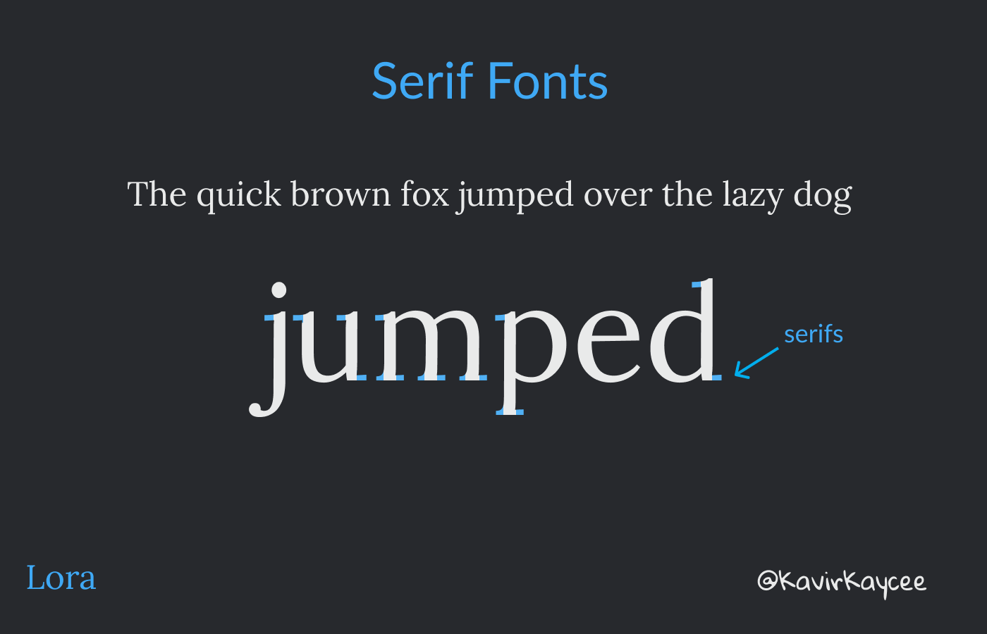
Serif fonts
Serifs are those small lines that are attached at the end of the letters. Any font which has these strokes are called serif fonts.
Serif fonts make the reading flow more natural. Hence, it is highly recommended for print and online publications where reading is a big part of the experience. This is why sites like Medium or the New York Times choose the serif fonts.
Laptops and phones now have higher resolution screens with 300+ppi resolution, making serif fonts look as good as serif fonts.
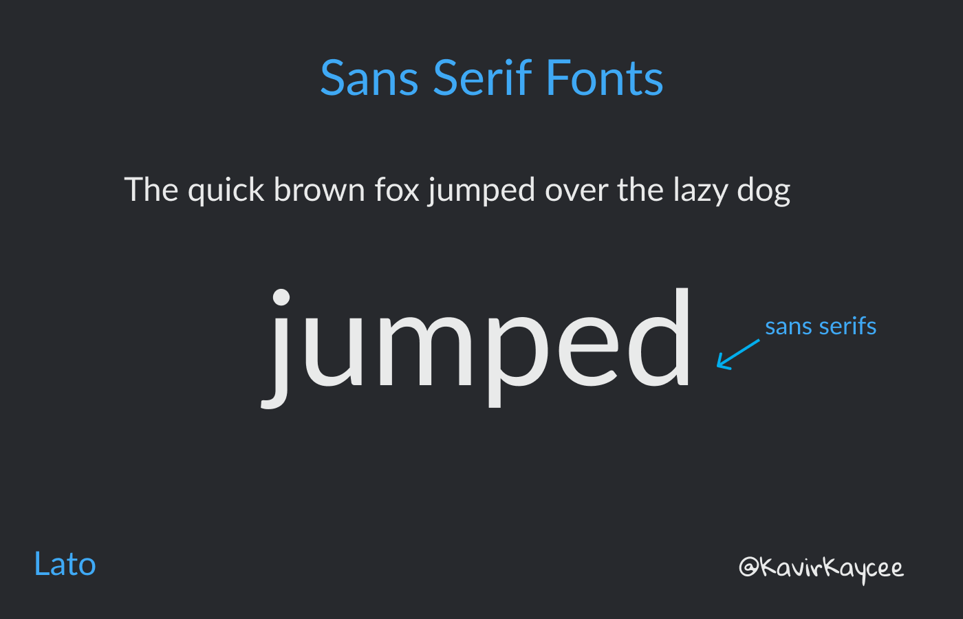
Sans serif fonts
Sans means without. So these are fonts without those small lines at the end.
They look cleaner and are more legible than serif fonts. It is commonly used in signboards on highways and metros where legibility matters more than aesthetics.
Most websites use Sans serif as the default font. Google search page, Facebook, Twitter, Netflix, etc.
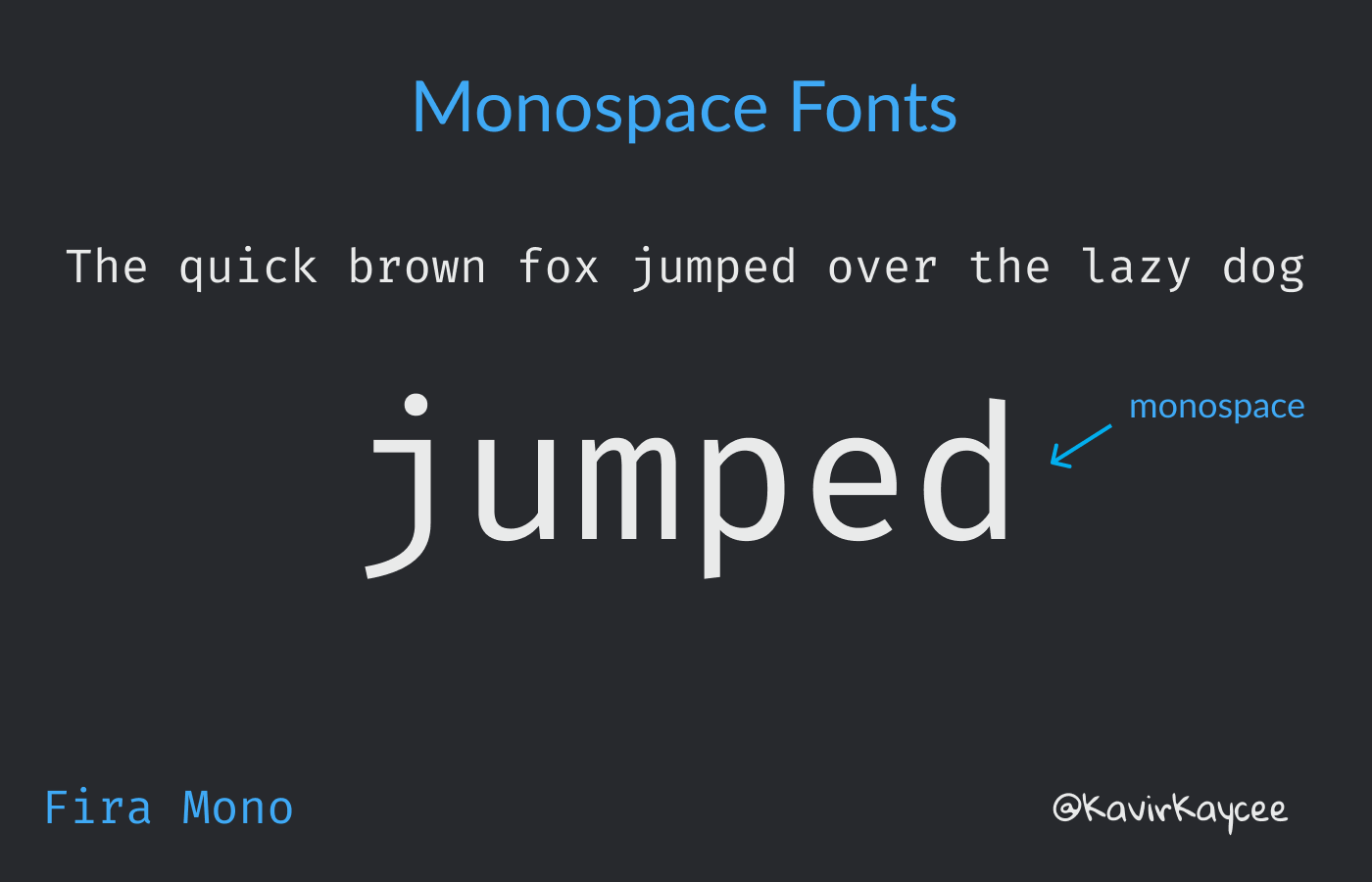
Monospace
Monospace means the space occupied by every character is the same. It's commonly used in movie/TV scripts and in coding.
Interestingly, for film scripts, one page of the script is supposed to be 1 minute of screen time with 55 lines. Monospace font establishes this predictability.
And for coding, it is a similar concept of alignment, predictability, and legibility enabled by the equal spacing of characters, especially punctuation marks.
Using a Monospace font while writing can also break the mental model of the process of writing vs reading. For example, if you write the first draft in the same font as what the reader will see, you will tend to over-edit when you should just be focussed on writing.
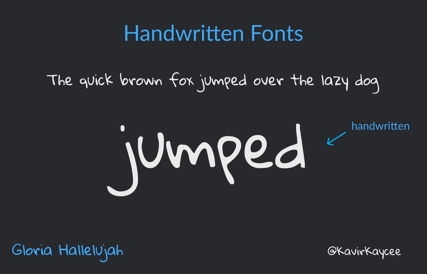
Handwritten fonts
Handwritten fonts simulate the experience of handwriting on a digital device.
What purpose does this serve? It makes the writing more informal and personal. Best used for diagrams, images, and other visual content.
For example, I use this font choice in my header images for my Twitter handle @KavirKaycee.
Terms
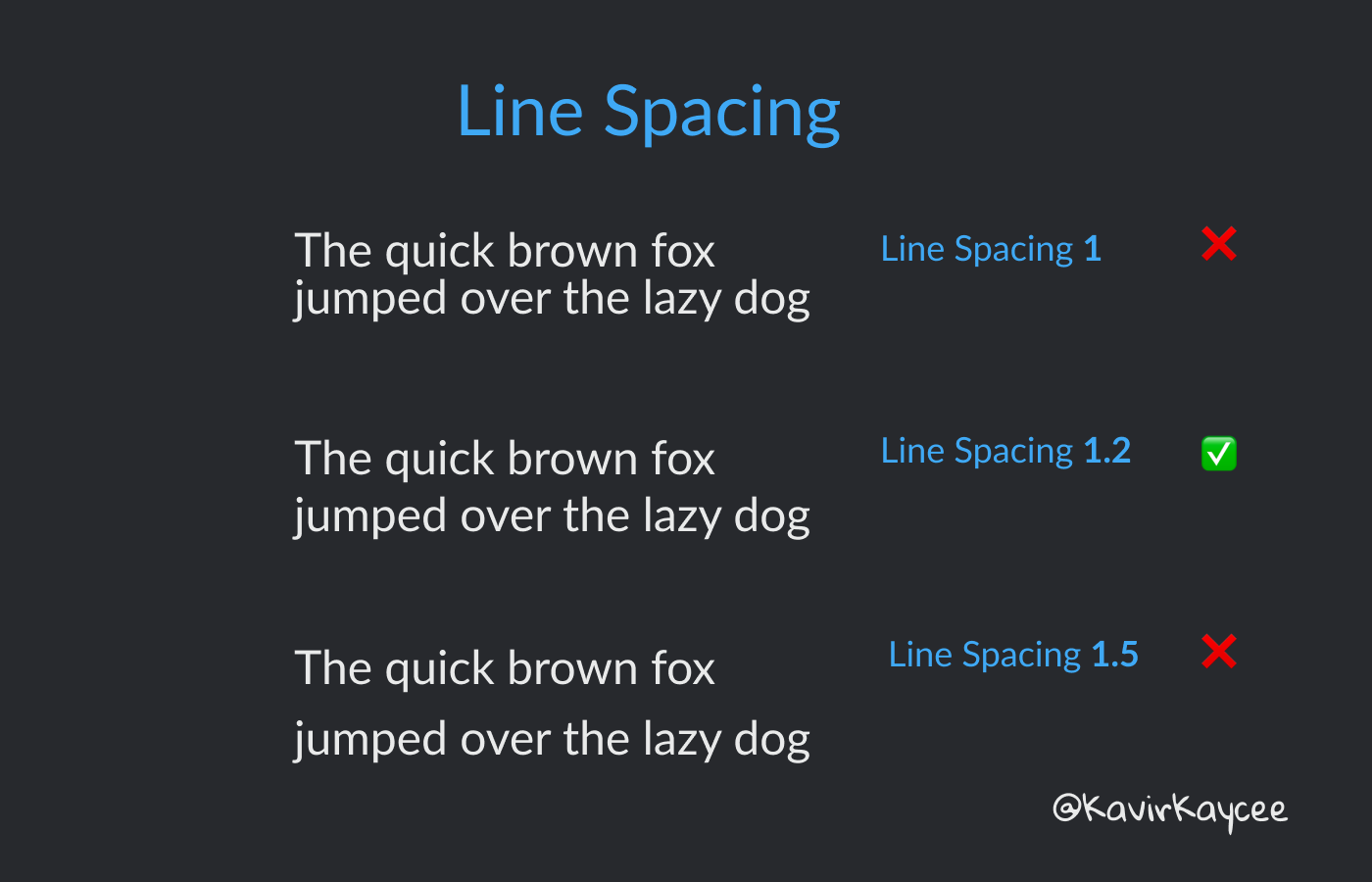
Line Spacing
It's the vertical space between two lines of text.
The ideal line spacing is between 1.15 and 1.3 for easy reading.
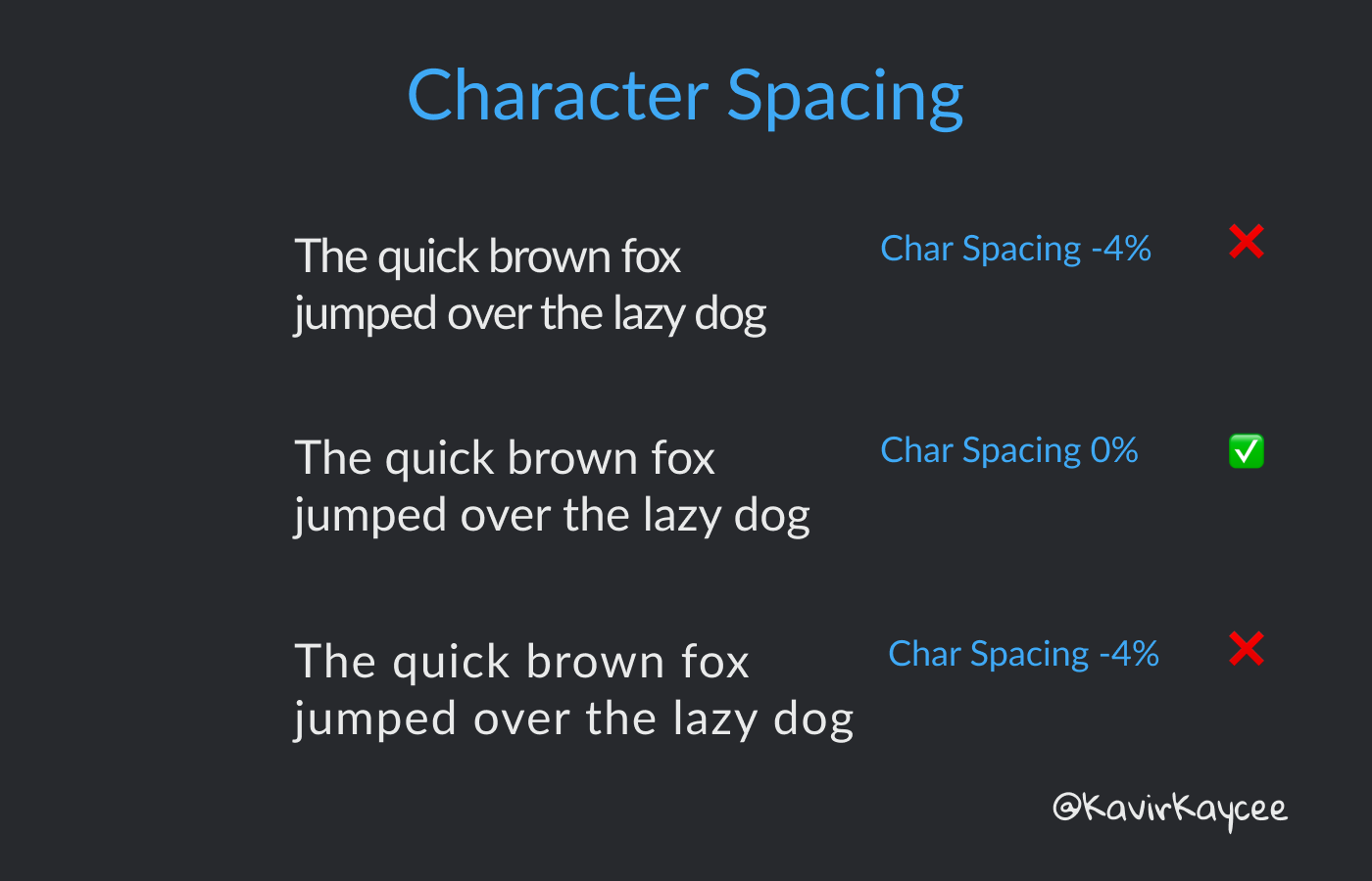
Character Spacing
This is the space between the letters.
Depending on the use case, you can always adjust the spacing. For text in ALL CAPS, you should increase the character spacing to improve readability.
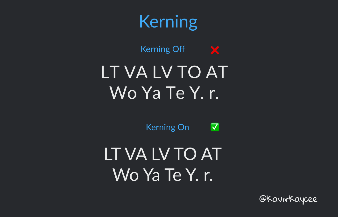
Kerning
Kerning is the space between specific combinations of letters. All you need to know is to turn this on so that the spacing looks more aesthetic to the eye.
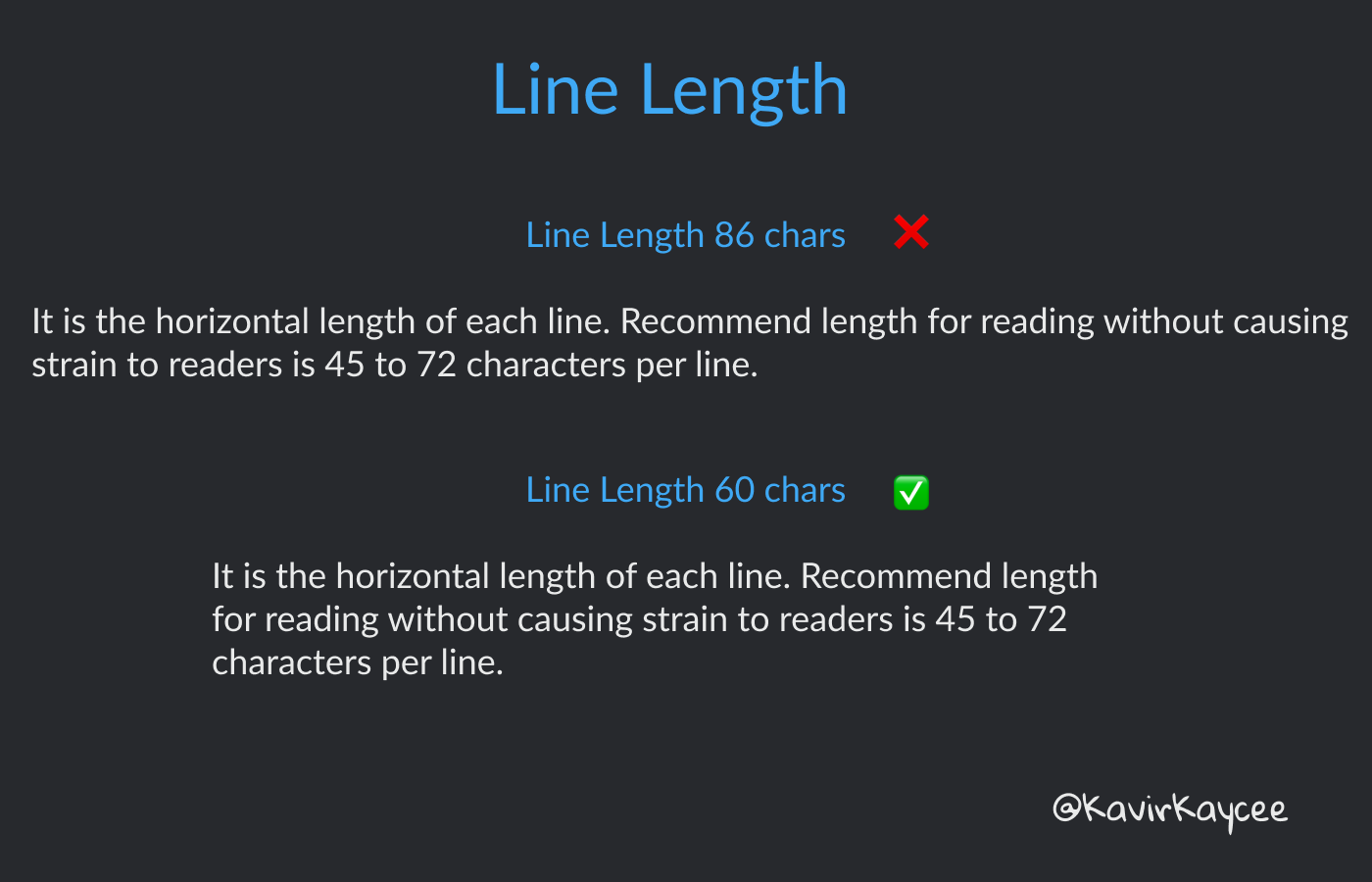
Line Length
It is the horizontal length of each line. The recommended length for reading without causing strain to readers is 45 to 72 characters per line.
Older readers would remember how website text went from edge to edge in the early days of the internet. One would have to literally move their head ever so slightly to be able to read the full line.
Nowadays, most websites that offer good reading experiences limit the horizontal line length to facilitate easier reading.
Justification
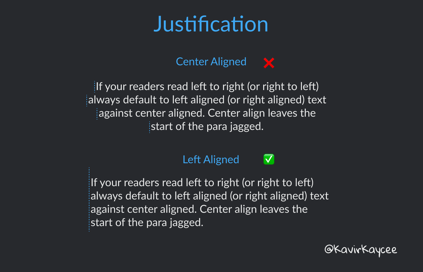
Justification is the alignment of the text in a paragraph. The options are left, center, and right-aligned.
If your readers read left to right (or right to left in certain cultures) and top to bottom - always default to left (or right) aligned text instead of center-aligned. Center align leaves the start of the para jagged.
How does this matter? Humans read in a Z pattern. Left to right (or right to left) and top to bottom. Having a consistent anchor to start the sentence makes it easier to read.
Fonts that I use
Best options for Serif fonts — Charter, Lora
Best options for San Serif fonts — Helvetica Neue, Lato, Proxima Nova
Avoid using system fonts like Times New Roman and Arial. And hopefully, I don’t need to tell you why not to use Comic Sans.
Further Reading:
Matthew Butterick’s Practical Typography — http://practicaltypography.com/
That's it for today. Next time someone on your team unironically suggests Comic Sans, you can share this piece with them ;)
Let me know how you liked this article. Comment on this and I would love to discuss it with you!
Talk to you soon!
— Kavir
P.S. Hit the subscribe button if you liked it! You’ll get insightful posts like this directly in your email inbox every week.


Fantastic read this morning. Thanks for the education.